blenz
01 — The Shift From quiet to confident · Beverage-first

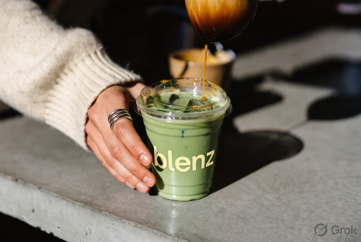
Coffee is the heritage.
Beverages are the future.

Blenz built a 30-year reputation on handcrafted lattes and BC warmth. The new identity keeps that warmth, drops the formality, and dresses for the next decade — bright, bold, made to be photographed and shared.

Was — 1992 to 2026

Polite. Quiet. A little beige.

Honey-yellow honesty. Frutiger uppercase. Rose-windmill icon. Read as warm but a little tired. Built to whisper "established," not to make anyone smile.

  • BLENZ COFFEE in formal caps
  • Muted Pantone 1215 honey
  • Watercolour mascot, used rarely
  • "Coffee" as the only category
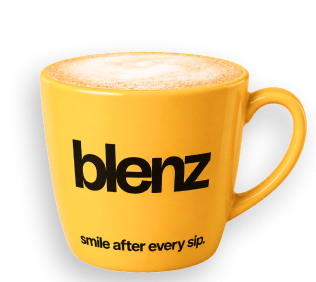
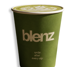
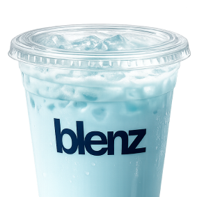
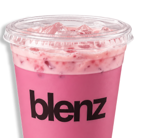
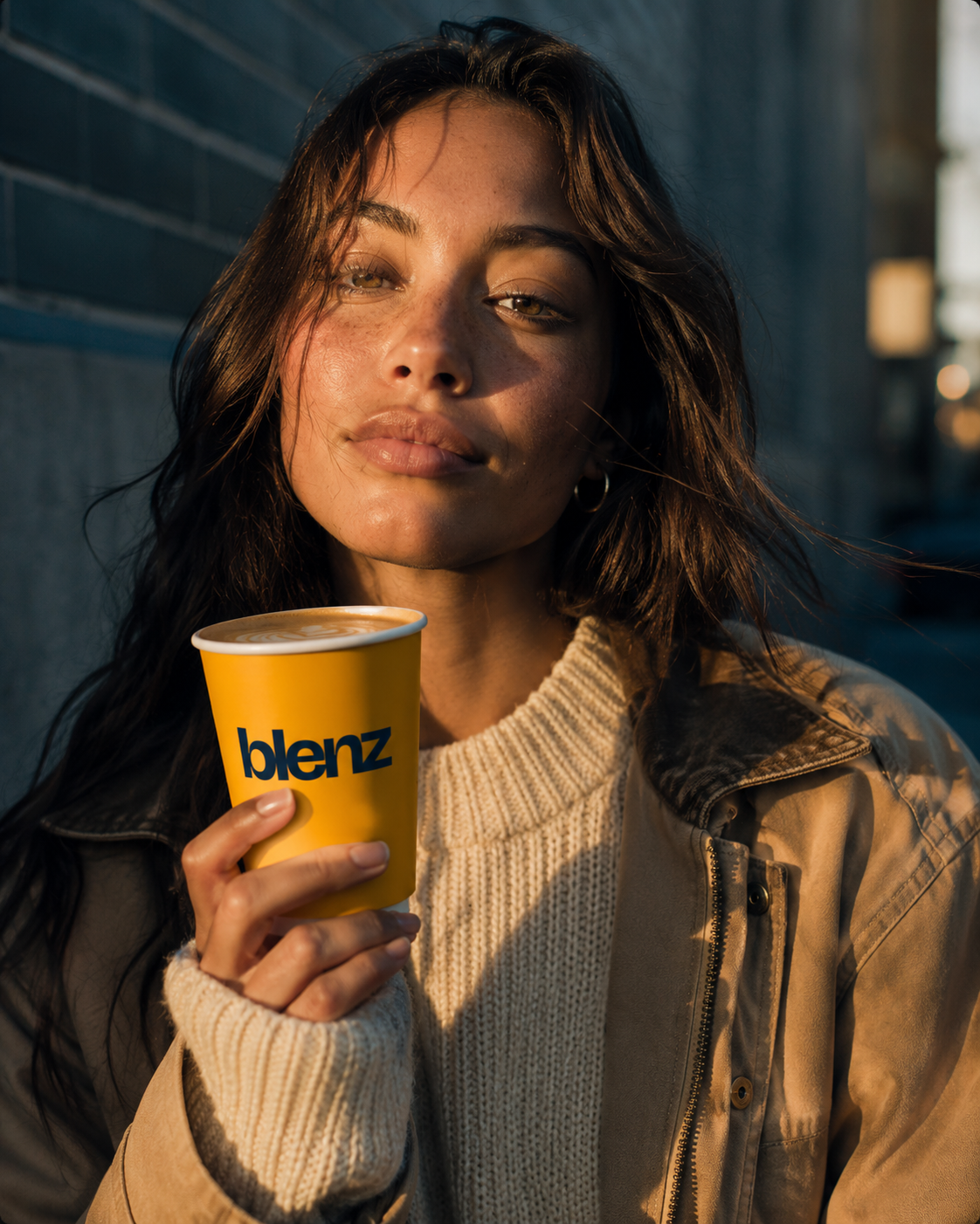
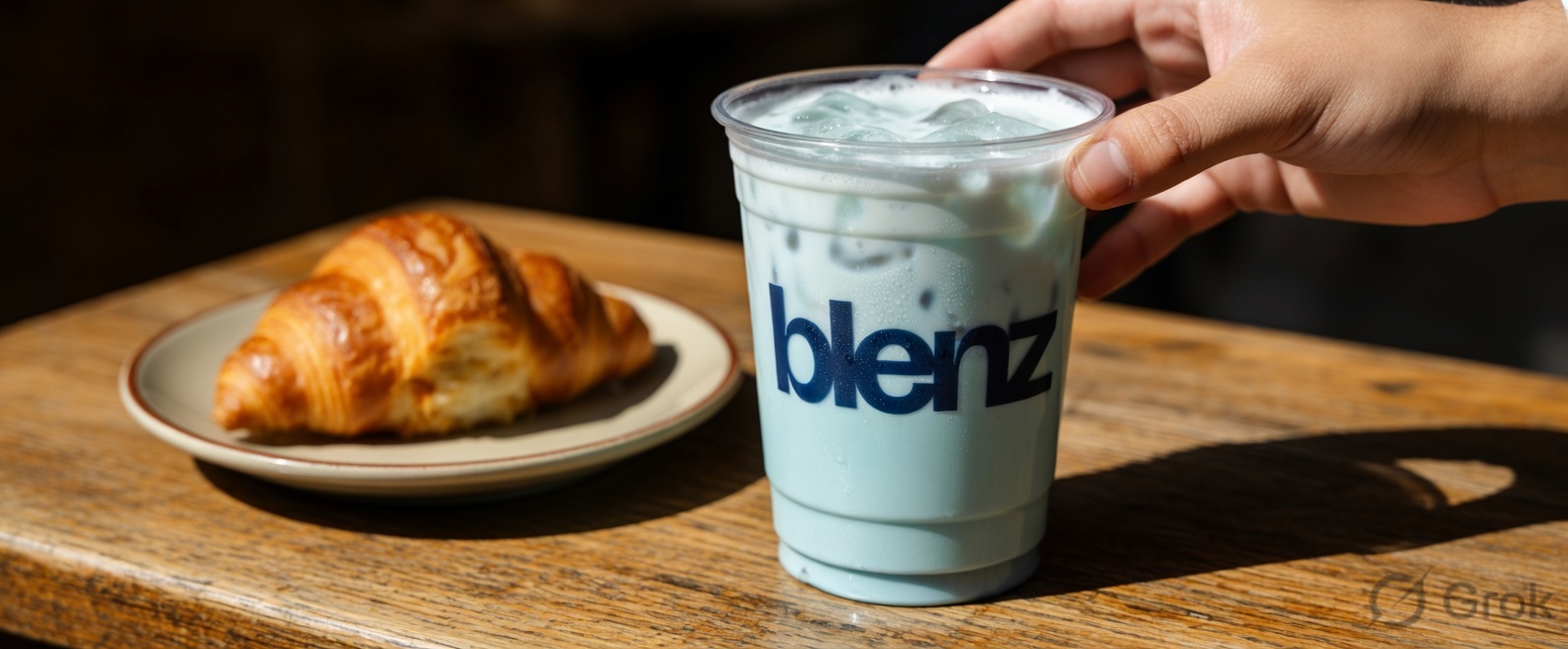
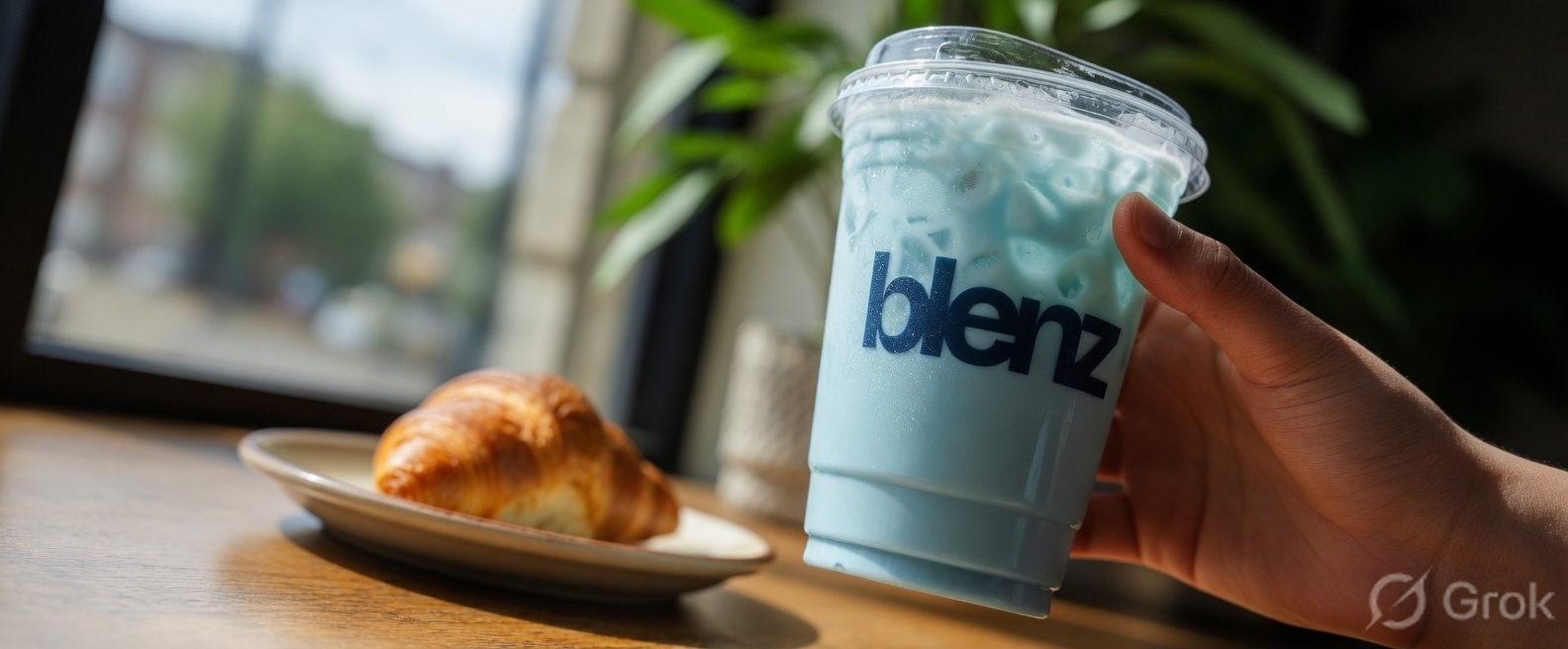
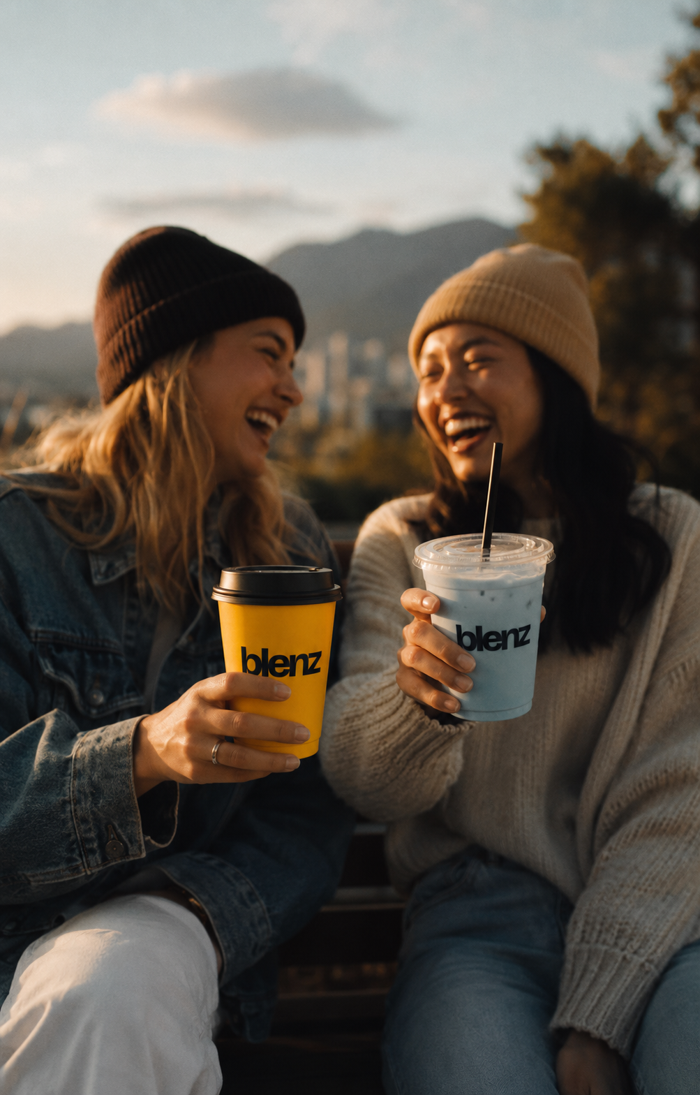
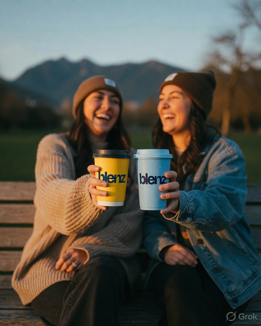
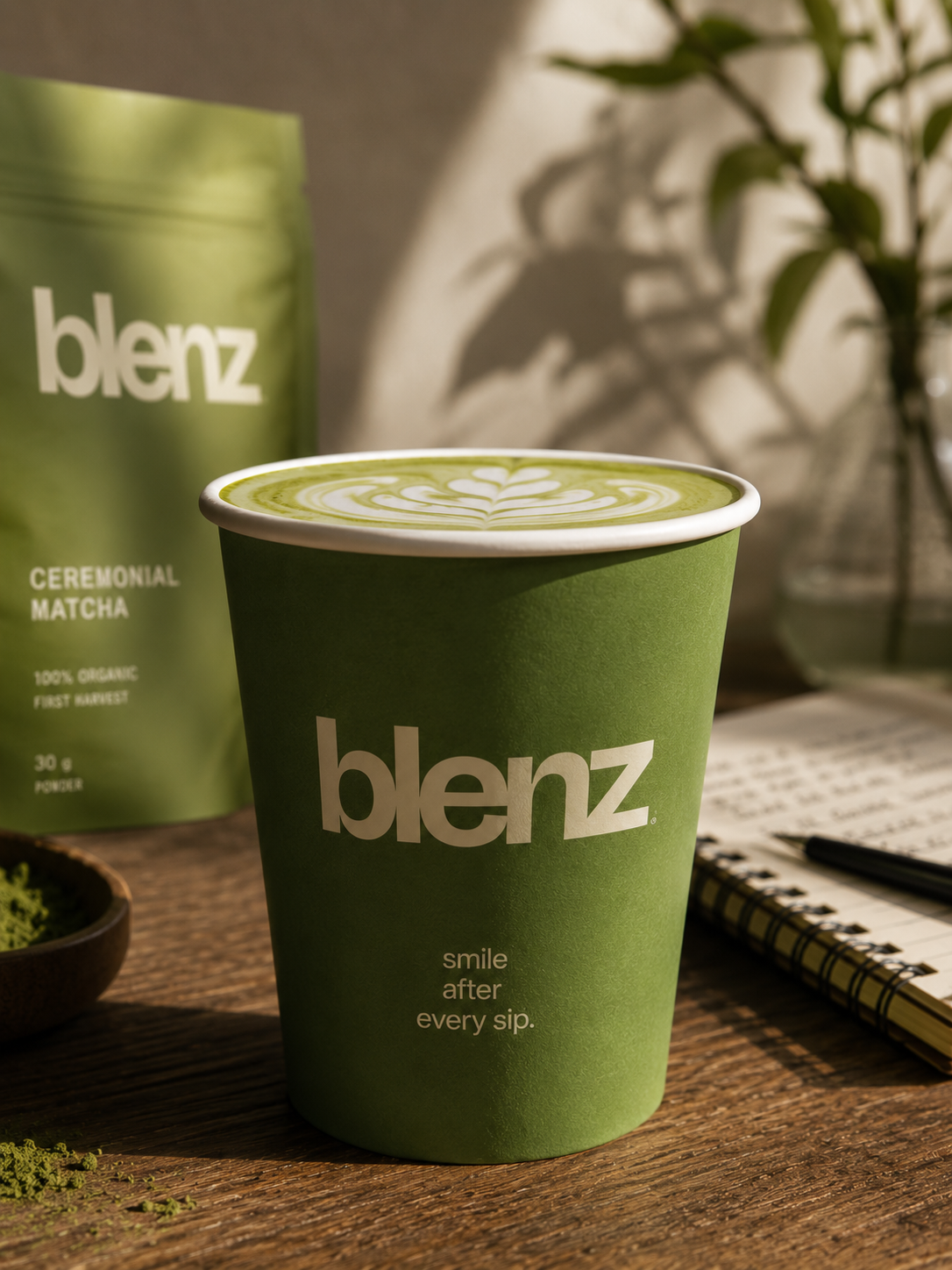
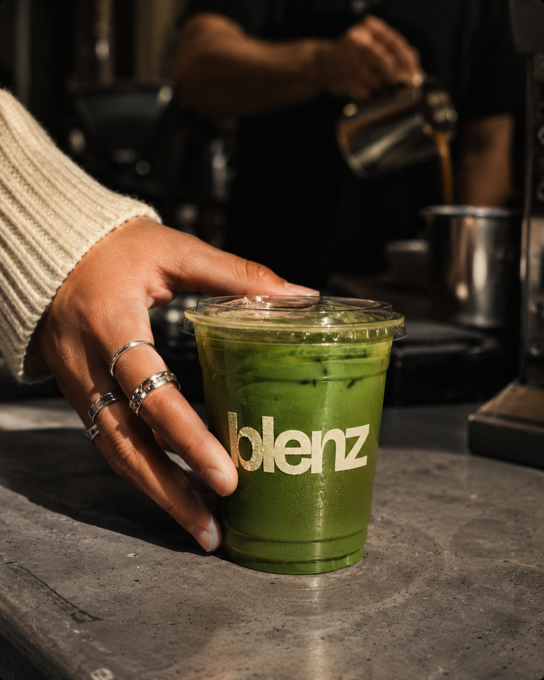
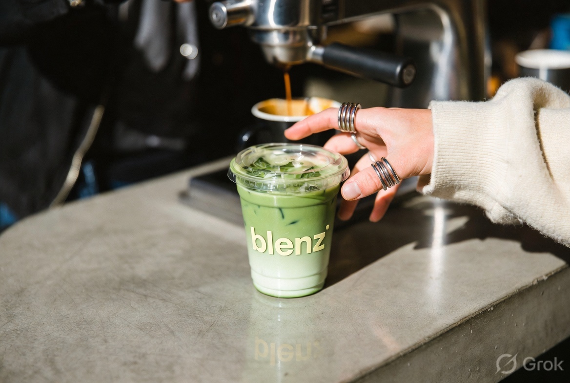
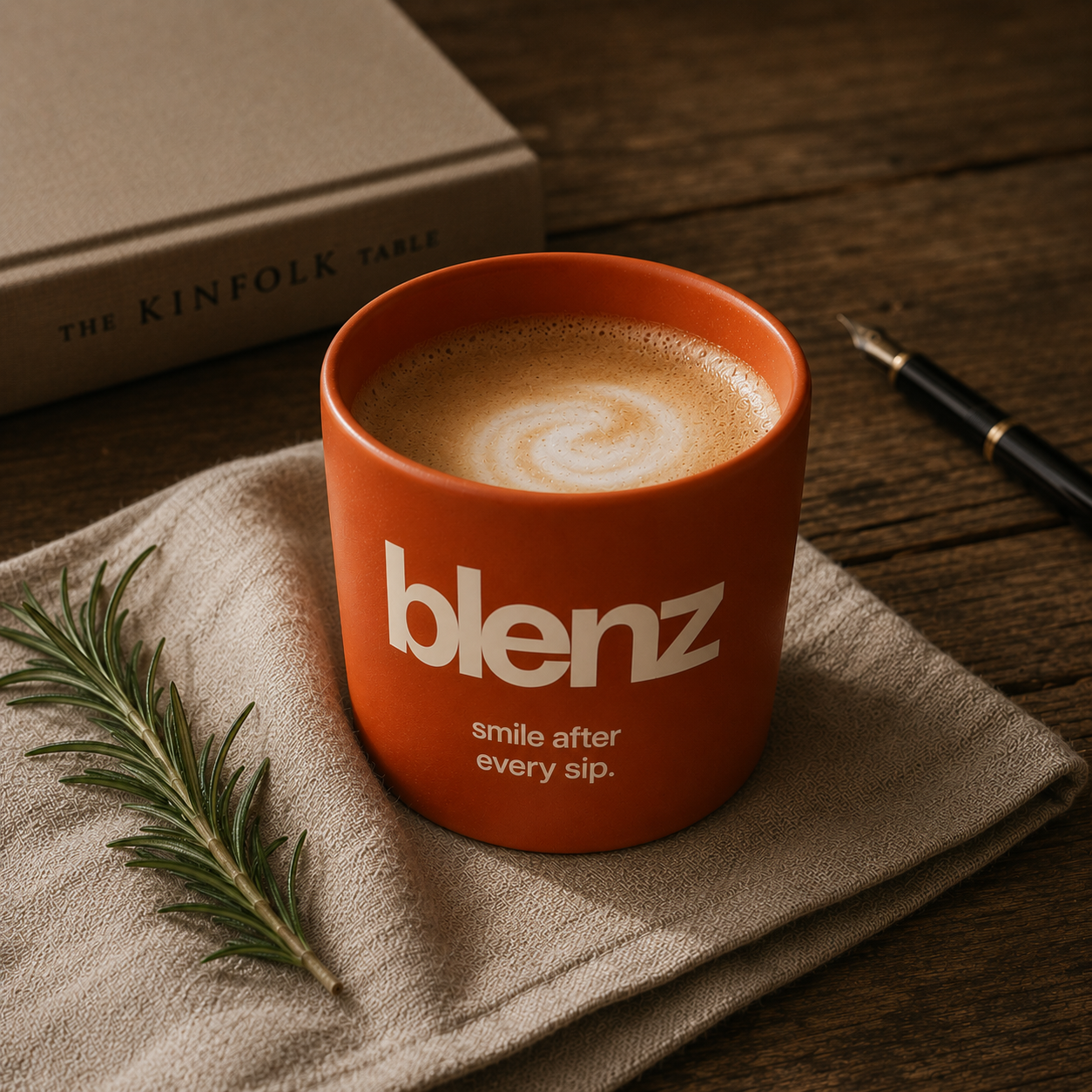
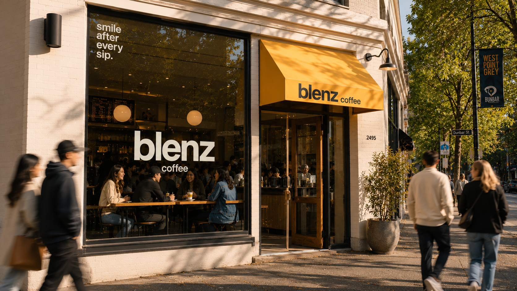
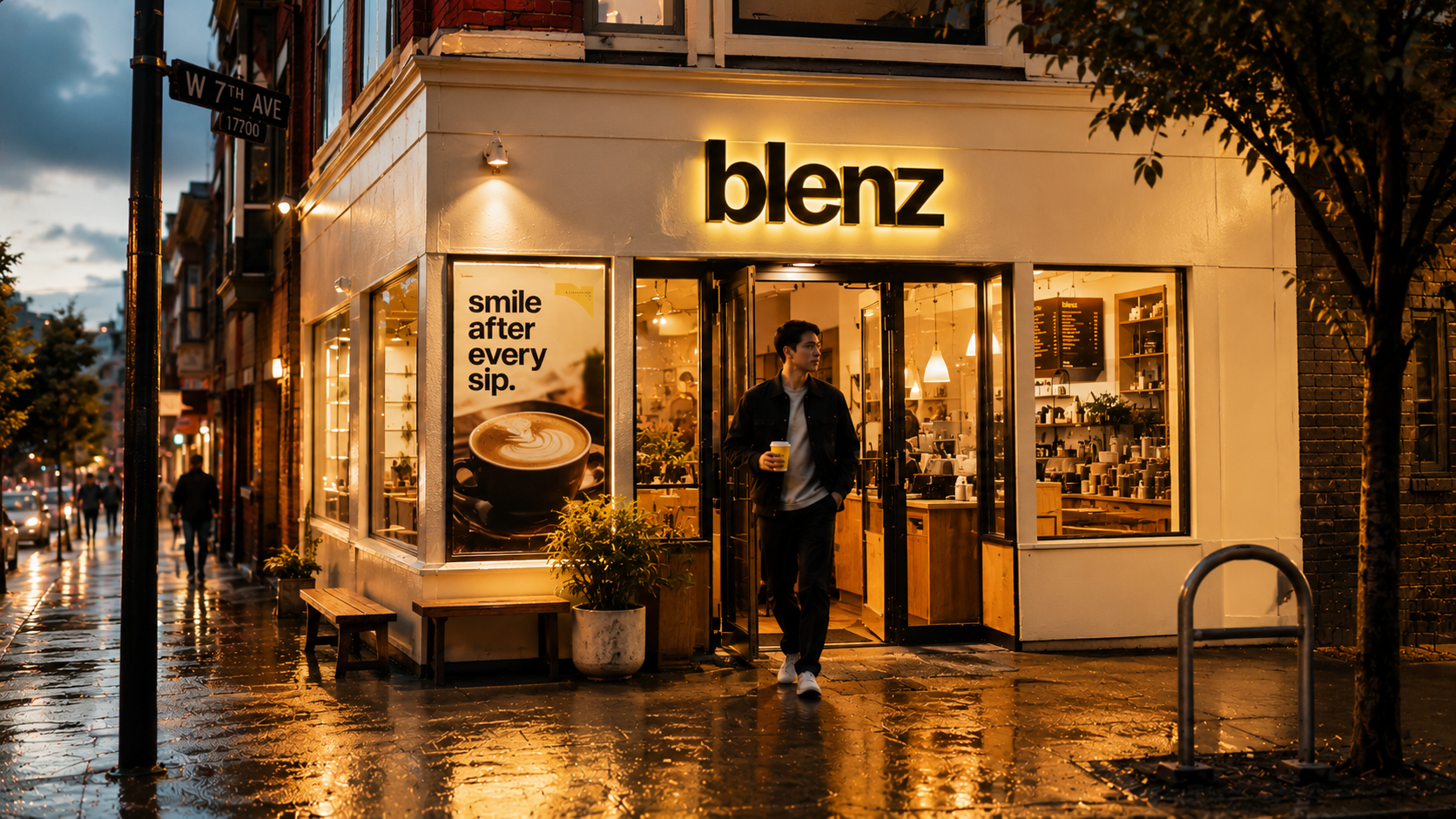
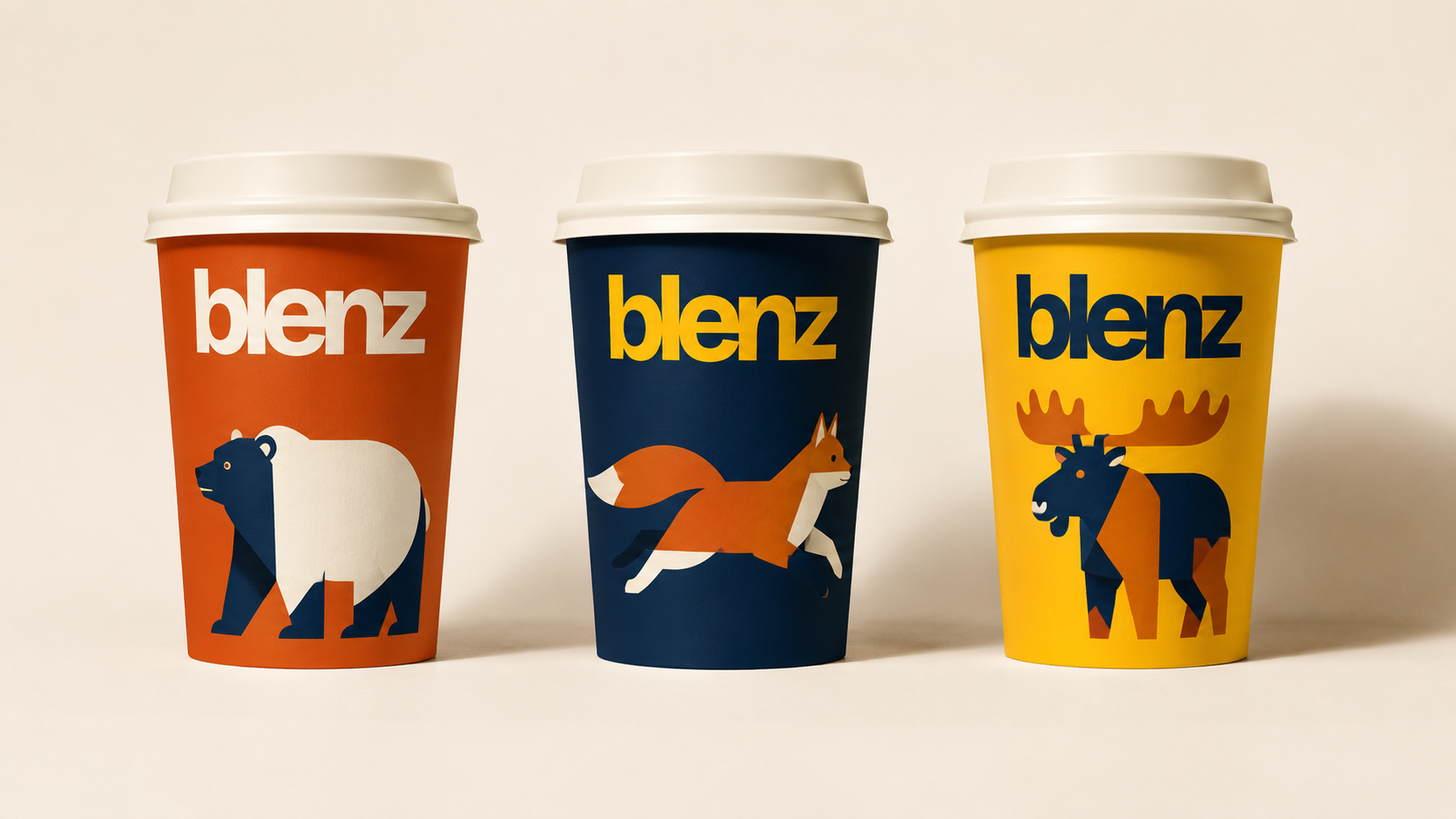
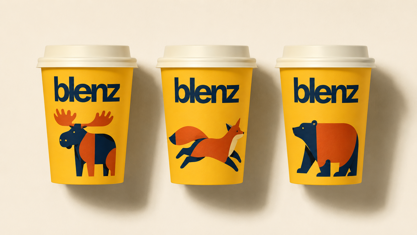
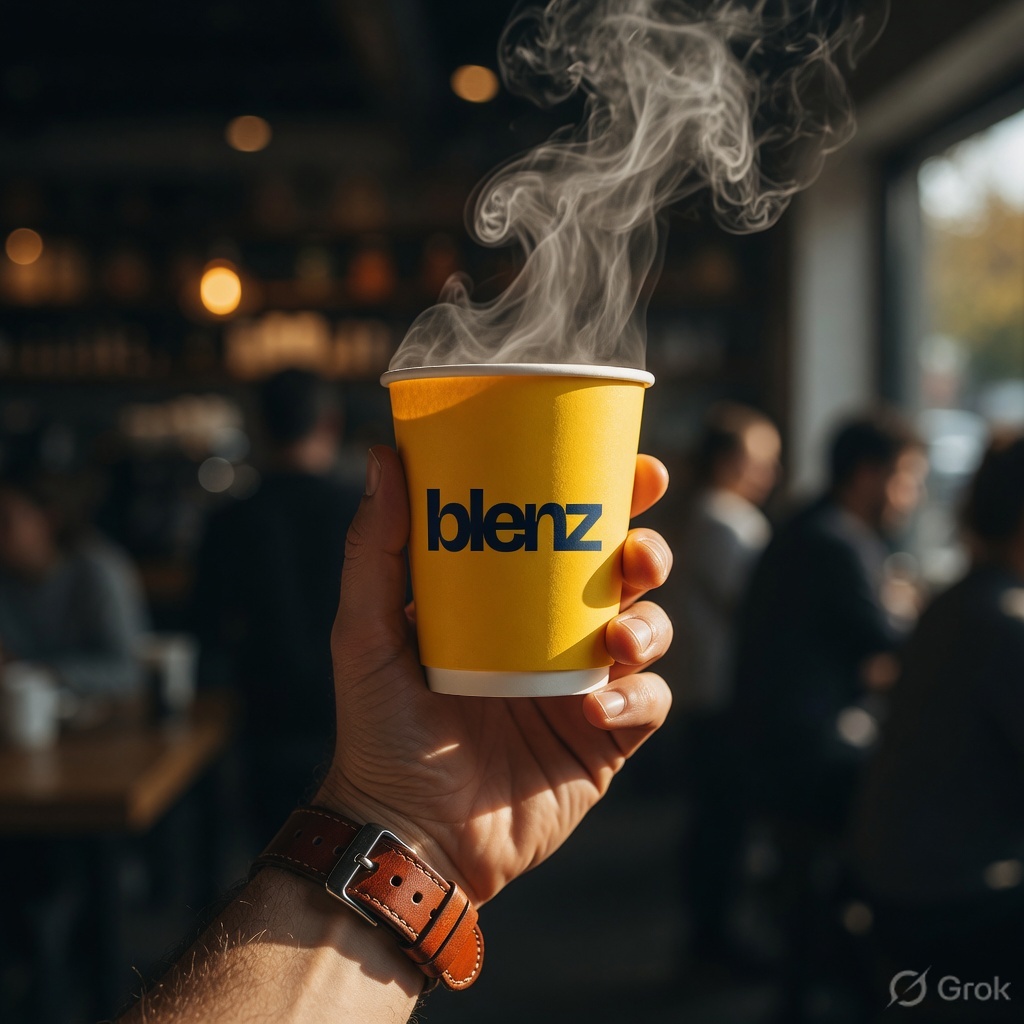
Is — 2026 onward

Loud. Lowercase. Yours.

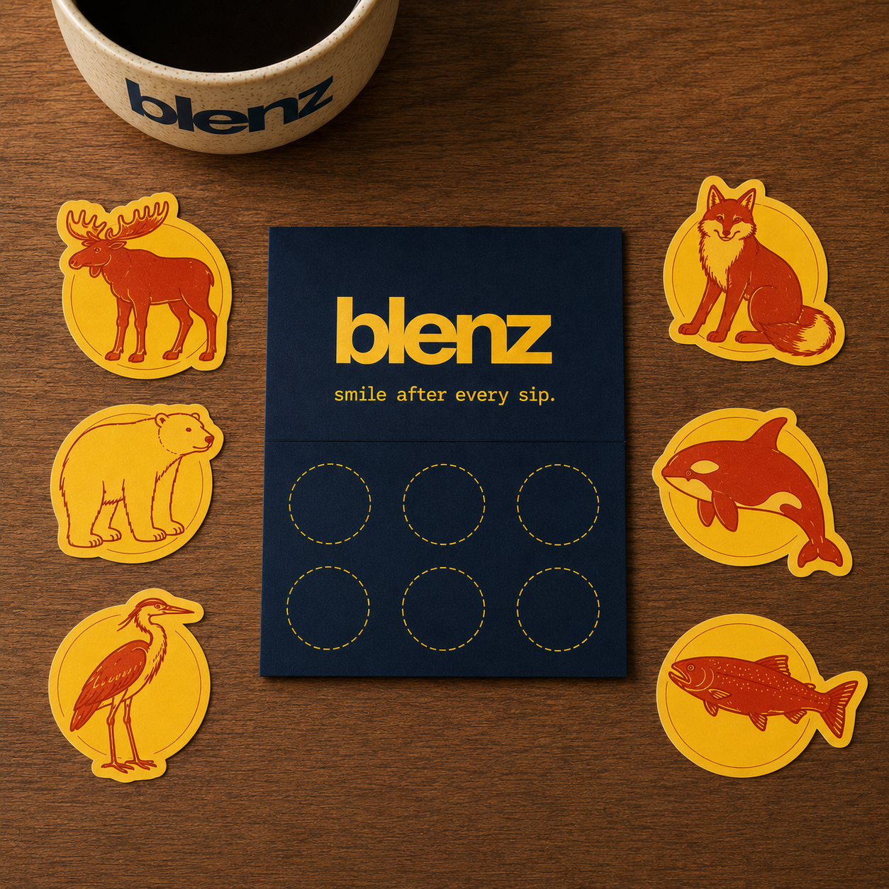
A bolder yellow that pops on a phone screen. A lowercase wordmark that feels like a friend, not a sign. A flexible cup colour system. A mascot you actually want on your jacket.

  • blenz lowercase, bold rounded sans
  • Vibrant Yellow #FFC107 + supporting category colours
  • Sticker-ready seasonal character drops
  • Coffee · Matcha · Cold · Specials
02 — Personality Four principles · One voice

A friend you trust to
start your morning right.

Blenz isn't trying to be cool. It's trying to be the spot you actually go to. The four principles below are how we behave on a cup, in a caption, on a sign, and at the till.

01

Warm, not cold

A regular's "good morning," not a server's script. We use names. We ask the small question.

02

Bold, not loud

Confident colour and type. No exclamation marks. The drink is the headline; the brand sets the table.

03

Local, not regional

Vancouver-made. BC-grown. Rooted in a real place, even when the brand travels to Toronto, Singapore, Dubai.

04

Made, not manufactured

Real ingredients. Real latte art. Real people behind the bar. Visibly human, deliberately handmade.

04 — Logo Usage Do · Don't · No exceptions

Treat the wordmark like a signature. Don't trace it twice.

Do
blenz
Set it big. Let it breathe. Keep tracking tight.
Don't
blenz
No italic. The wordmark is upright. Always.
Do
blenz®
The rust ® is allowed at hero scale. It's part of the personality.
Don't
BLENZ
Never set the wordmark in uppercase. Lowercase is the brand.
05 — Colour Yellow always wins · Categories supply the rest

Yellow is the brand.
Everything else supports.

A warmer, brighter yellow takes over from honey-Pantone 1215. Navy anchors. Rust accents. Three category colours — matcha, ice, berry — earn their place on cups when the drink calls for them.

blenz Yellow
Hero · Primary · The brand
HEX · #FFC107 RGB · 255 193 7 CMYK · 0 24 97 0 Pantone · 7549 C
Deep Navy
Anchor · Type · Backdrop
HEX · #0A2540 RGB · 10 37 64 CMYK · 84 42 0 75
Rust
Accent · Stickers · ® mark
HEX · #C2410C RGB · 194 65 12
Matcha
Category · Tea drinks
HEX · #6B8E4E RGB · 107 142 78
Ice
Category · Cold drinks
HEX · #A8D5E5 RGB · 168 213 229
Berry
Specials · Blue Latte
#C44569
Cream
Soft background
#FFF6E0
Pop Yellow
Hi-vis · UI accents
#FFD60A
Espresso
Body type · Dark mode
#1A0F08
06 — Cup System One cup per category · Same wordmark · Different colour

Pick a colour.
Pick a drink.

Every Blenz drink lands in a colour-coded cup. The wordmark is constant. The colour signals what's inside. Customers learn the system in one visit and become walking ads on their second.

Cup 01 · Yellow

Coffee & Espresso

Yellow Cup
Cup 02 · Matcha

Tea & Matcha

Tea & Matcha
Cup 03 · Ice

Cold & Iced

Cold & Iced
Cup 04 · Berry

Specials & Latte

Berry Cup
07 — Photography Warm · Documentary · BC light

Real drinks. Real
hands. Real light.

No stock. No overhead beige flatlays. Photography looks shot on a film camera by someone who actually drinks the coffee. Golden hour, candid, slightly imperfect.

Hero shot — yellow blenz takeaway cup, golden hour Vancouver light
Matcha drink outside
08 — Typography Bricolage Grotesque · Hanken · JetBrains Mono

Three voices.
One conversation.

All sans-serif. All contemporary. The display does the talking, the body keeps things grounded, and the mono signals "this is a label, not a sentence."

Display · Headlines

Bricolage Grotesque

Weights · 700 / 800
Optical size · 36 — 48
Tracking · −0.045em hero
Always upright · Never italic

smile
after
every sip.
Body · Interface

Hanken Grotesk

Weights · 400 / 500 / 600 / 800
Tracking · 0
Line-height · 1.5 body, 1.4 lead
For paragraphs, captions, all interface

Made by hand. Made in BC. Made for the morning you didn't expect to enjoy.
Mono · Labels & Eyebrows

JetBrains Mono

Weight · 500
Tracking · 0.16em — 0.20em
Always uppercase
Three words max · Never paragraphs

— Vancouver · Made by hand
09 — Graphic System Stripes · Badges · Brackets

Four moves. Used
everywhere. Always.

A small, memorable kit of graphic devices that makes any Blenz touchpoint instantly readable. Stripes for packaging. Badge for stickers. Bracket copy for brand voice. The seasonal character for warmth.

01 · The Stripe
Yellow + Navy
house pattern.
02 · The Badge
b®
Sticker · App icon · Pin
03 · The Bracket ( bc · since '92 ) Copy device
04 · Seasonal Drop Limited.
Every season.
BC characters · Cup art
10 — Seasonal Limited drops · BC characters · Every season

A new cup every
season. Always blenz.

Seasonal cup characters celebrate BC — moose, fox, orca, grizzly. The wordmark stays fixed. The illustration below it changes. One cup becomes the must-have of the season.

11 — Voice

Specific. Brief. Local.
Always present-tense.

Blenz writes the way a regular speaks. Short sentences. Strong verbs. Real ingredients. Real places. No wellness-speak, no "elevating your daily ritual," no exclamation marks doing the heavy lifting.

This

"Made by hand. Made in BC. Made for you."

Not this

"Elevating your daily ritual through premium handcrafted experiences."

This

"Cold brew, slow brewed. Twelve hours, no shortcuts."

Not this

"Discover our artisanal cold brew journey, where time meets craft."

This

"Smile after every sip."

Not this

"Where flavour meets joy in every moment."

12 — Applications Cup · Bag · Storefront · Menu

The brand
you can hold.

When the wordmark hits paper, fabric, and storefront, this is what it should look like. Bold, unmistakable, photographable from across the room.

blenz hot takeaway cup — yellow ground, navy wordmark 12.1 — Hot cup · Primary colourway
12.2 — Takeaway bag
12.3 — Storefront signage
12.4 — Menu board
13 — Merch Two starter items · Built to be loved

Things people
actually want.

Two carefully chosen pieces to start. Both made to live in someone's daily life — not stacked on a counter shelf gathering dust. Sticker-card loyalty replaces the punch card.

Item 01

The Everyday Tote

Heavy 12oz natural canvas. Two-colour screen print. Reinforced 38cm straps. Heritage badge stitched inside seam.

Material
12oz natural cotton
Print
Navy + Rust, 2-colour
Blenz Sticker Card
Item 02

The Sticker Card

Replaces the punch card. New collectible sticker drops every month. Seven stickers earn the eighth drink free. The card itself becomes the keepsake.

Format
85 × 54 mm
Stock
350gsm uncoated navy
Foil
Yellow foil block · b mark
Reward
Collect 7 → 8th free
14 — Digital App · Web · Social

Built for the
phone-first world.

Digital is where Gen Z meets the brand first. The app icon is the b. The web hero is the wordmark and a single drink. Social is the sticker drop, the cup grid, the "what's new" cup colour.

b
App icon · iOS, Android
blenz
Web hero · Desktop & mobile
@blenz
Social profile · Instagram, TikTok
15 — Motion Soft easing · Confident timing

Movement that feels
warm, never frantic.

Motion follows the same logic as the type — confident, unhurried, never showy. Easing is custom-tuned to feel like a slow exhale. Six rules, applied everywhere.

M·01 Soft Ease cubic-bezier(0.32, 0.72, 0, 1) — primary easing curve. Used for nav, hover, page transitions.
M·02 Character Bounce 220ms ease-out + 80ms settle. Used when seasonal characters animate (sticker reveal, cup drop).
M·03 Wordmark Settle Opacity 0 → 1 with subtle 8px upward drift. 480ms. Used on hero load and section reveals.
M·04 Pour Animation For drink visualisations only. Liquid fills cup vertically, 600ms ease-in-out, slight overshoot.
M·05 Sticker Pop Scale 0.8 → 1.05 → 1.0 with rotation jitter ±2°. Used on loyalty stamp moments.
M·06 Stripe Slide Background-position scroll on stripe pattern, infinite loop, 12s linear. Subtle, never distracting.